UPDATE: (January 2017) We apologize for the credit error: The designer responsible for the US Squash logo is Chrys Sbily who is the award winning branding and creative director at CSA Studio in Maryland,USA.
Adriana J Moreno was responsible for a variety of collateral work and support print materials that used Chrys’ logo. (Hat tip to Conor O’Malley, who was the Director of Events at US Squash when the logo was created, for setting us straight. Thanks Conor!)
UPDATE: (June 2014) We finally discovered who designed the new US Squash logo. Adriana J Moreno has done some really fantastic work and you can check out her collateral for US Squash on her website.
In case you missed it, the national organizing body and membership organization for the sport of squash in the United States just recently launched their new logo. According to their online press release this rebranding apparently represents an “historic commitment to elite athlete development”. Since it’s inception in 1904 US Squash has had six logos (four of them with crossed wooden racquets) but you’re probably most familiar with the longest running and most recent one:

As much as we like this logo we can completely understand why they’d want to update it. As SquashSource has pointed out this crossed-racquet logo speaks mainly to the history of the game and, as a result, may feed the silly notion that squash is an elite sport played by preppy gentlemen in white clothing in men’s clubs. If you’re reading this you know it’s not and modernization is not our problem with this new logo.
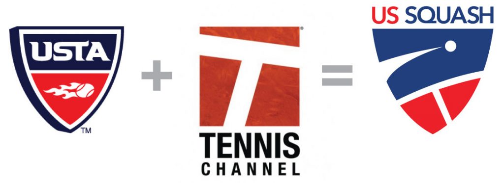
US Squash itself hints at the problem when they state in their press release that the logo is “similar to other U.S. national sports governing bodies”. Which national sports governing body could they be referring to specifically? How about the United States Tennis Association? Couple that logo with the Tennis Channel’s brand and presto you’ve got the new US Squash logo. What are your thoughts on this logo?

